We’ve completed a comprehensive accessibility update to improve the experience for users of assistive technologies and ensure compliance with WCAG 2.1/2.2 Level AA standards. These updates are now available for preview in the myTurn test environment.
The changes outlined below are planned to be launched on the weekend of April 25th to give you time to review the changes. We have tried to make them as backwards compatible as possible, including with existing custom CSS and styling.
An updated VPAT for the public site will be released at that time.
VPAT availability: An new Accessibility page on our website and Voluntary Product Accessibility Template (VPAT) for the public-facing site will be posted when the changes go live.
WCAG / Accessibility Changes
Some of the changes and improvements are outlined below.
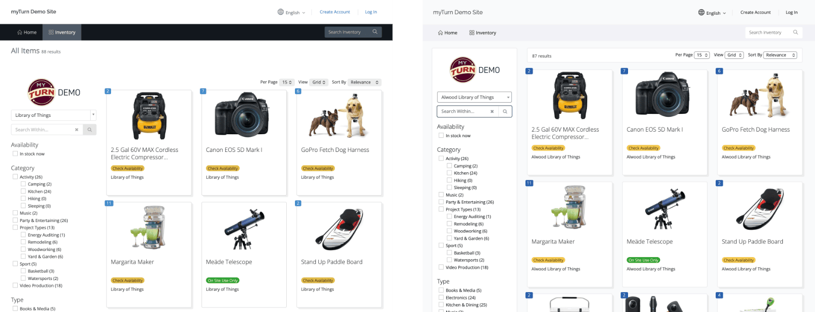
Existing (left) and the new WCAG Compliance Layouts (right)
Keyboard Navigation
- Visible focus indicators: All interactive elements now display clear focus outlines when navigating with a keyboard, making it easier to track your position on the page.
- Improved filter controls: When filters reload the page, focus returns to the control you just used rather than jumping to the top of the page.
- Skip to main content: The skip link now displays properly when focused, allowing keyboard users to bypass navigation menus.
Screen Reader Support
- Better form labels: Radio button and checkbox groups are now properly announced with their question text, so screen reader users hear the full context.
- Clearer table navigation: Data tables now include row headers, so action links like “Edit” and “Remove” are announced with the item or project name they apply to.
- Sortable column improvements: Table column headers no longer announce verbose sorting instructions; current sort state is conveyed through proper ARIA attributes.
- Descriptive action buttons: Delete and remove buttons now include the item name in their accessible label for clarity when multiple items are listed.
Visual Improvements
- Improved contrast:
- All default myTurn colors on the public site will now fully meat WCAG contrast requirements. This necessitated changes to the default colors we use on the site.
- Form field borders, placeholder text, and focus indicators now meet minimum contrast requirements for users with low vision.
- Consistent styling: Focus styles are uniform across buttons, links, dropdowns, and form controls.
Dropdown and Date Controls
- Upgraded dropdown controls: Location filters and other dropdown menus now use improved components with better keyboard and screen reader support.
- Date picker improvements: Navigation buttons (previous/next month) are now keyboard accessible. Full day-cell navigation will be addressed in a future release.
Homepage Content Editing
We’ve improved the content editing experience for your organization’s homepage:
- Heading support: You can now add proper heading levels (H1–H5) to homepage content sections, which helps screen reader users navigate your page by topic.
- Improved heading display: Heading styles are now more visually distinct and consistent.
A Note on Customer Content
These updates ensure the myTurn platform itself meets accessibility standards. However, content you add—such as images, documents, and formatted text—also needs to be accessible. A few tips:
- Add alt text to images: Describe what the image shows so screen reader users understand its purpose.
- Use headings to organize content: The new heading options help users navigate long pages.
- Avoid images of text: When possible, use actual text rather than images containing text, which can’t be resized or read by assistive technology.
We’re happy to help if you have questions about making your content more accessible.
Preview these changes in the myTurn testing environment:
- You can view one of our demo sites.
- Log in to your myTurn test environment to see the updates before they go live. Contact us for access and information about our test environment.